
7 Things Web Designers Have to Learn by 2014
Responsive Web Design
Responsive web design (RWD) focuses on a method of using a fluid grid, flexible images, CSS (Cascading Style Sheets) media queries to design websites so that no matter what device the end user accessing the site from it fits the screen.
This is accomplished by setting percentages instead of pixels or points thereby making the site responsive to the screen you are viewing it on. For example a logo may typically be set as a specific size in pixels that takes up about 1/6thof the header whereas using RWD it might be set as 16% of the header size.
Retina Ready Graphics
Apple products hold a very high percentage of the market for smart devices. In June Apple announced over 600 million devices sold that use iOS. Originally iOS was introduced for the iPhone but has now expanded to iPads and iPods. Apple products such as the iPad are now utilizing retina ready graphics on the retina display screens. The retina display screen on an iPad contains over 3 million pixels and a resolution of 2048 by 1536-pixels.
Up scaling existing graphics can be tricky and if not executed properly will only pixelate making the site look much worse on Apple devices.
Stay updated with the font trends
It is vital to stay updated with font trends. Mixing the wrong font with a design can make your site look bad to customers who have millions of websites at the touch of the fingertip to compare your site to. If you follow the new flat design trend then selecting the right font to go with your flat design will help make your design a successful one.
Did you know that font is also effected by the retina display screens? For example a website without retina ready font will look just great on an Apple MacBook Pro without the retina display but that same font may look fuzzy on one with the retina display feature.
Over 30 million devices with retina display being sold means that many potential customers may bounce from your website within 10 seconds of landing there.
Icons retina ready
Icons will need to be retina ready in 2014. Smart devices are quickly being snapped up by customers as fast as they can be produced. Apple releases draw lines of customers waiting sometimes hours to get their hands on the newest version of the iPhone or iPad.
But retina ready icons aren’t just for Apple products they will help the look on any platform. Almost all touch screen devices now have the capability to pinch or zoom an image larger or smaller. As you expand a normal image you will see pixilation around the edges and ultimately the entire image if the resolution is too small.
Style is going flat
Web design is going flat as some of you may recall decades ago when the internet was in its infancy stage websites were a very flat style. Because so many devices are a flat surface where 3D imaging isn’t representative in appearance the trend is heading back to the days of flat designs.
Flat designs take away the drop shadows and utilize strong lines with little to no gradients. Use of bright colors and stylish typography with no 3D effects is going to be a strong trend in 2014. Flat web designs are a popular demand right now leading up to a new year filled with sites changing their look to a flat design.<
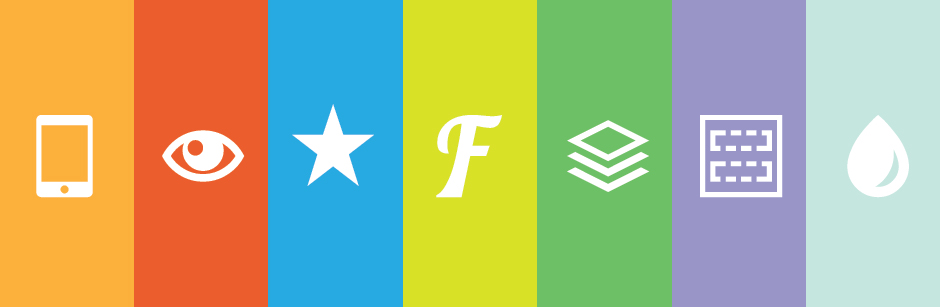
Framework
The most popular responsive HTML5 framework packages:
Bootstrap by Twitter is known for being a powerful very mobile front-end/UI (User Interface) framework. Bootstrap is a large toolkit with a collection of CSS and HTML that encompasses typography, forms, tables, buttons and more.
Foundation by Zurb boasts of being the most advanced responsive front-end framework in the world. Its flexibility makes it a good option for building prototypes or production codes.
Skeleton is as the name implies a boilerplate that is more a kit or collection of CSS that includes the most basic styles to create a base or foundation to build off of. This is a not a UI framework, relatively lightweight and uses a simple grid system.
Flat colors schemes

Flat color schemes are becoming more and more popular by the day as site owners want their sites to be minimalized so that they are not cumbersome for potential customers or clients. Flat color schemes will be bright and bold or retro in appearance. These flat color schemes will be used to create the flat design websites that are setting the trends heading into 2014.
You can find more Flat color schemes @ colorlovers.com
So?! what do you think?